
What Is YouTube Shorts Ratio? Is It 16:9 Or 3:4? (Know Which One To Use)
sibashree bhattacharya, 2 hours ago
YouTube Shorts are all hearts after the June 2026 updates!
These are now one of the very few things on the internet not to have a dislike button. You can now play it at 2X speed. And the best part?
It now has a heart button.
Though there is no update this time for the YouTube Shorts ratio, it remains an important aspect of giving the Shorts a professional look and ensuring a seamless viewing experience.
Still, the various options in the YouTube Shorts video can be overwhelming. Is it 16:9? 3:4? or 1:1?
Also, in my 10 years of working across social media platforms, I have helped brands and creators get their video formatting right.
Aspect ratio is one of those small technical details that very subtly decides the performance of YouTube Shorts.
If you get the ratio wrong, your video will show up with clunky black bars or get buried by the algorithm.
However, when you get it right, it will fill the screen as intended. So, let’s discuss the right ratio for your YouTube Shorts and how to get it right.
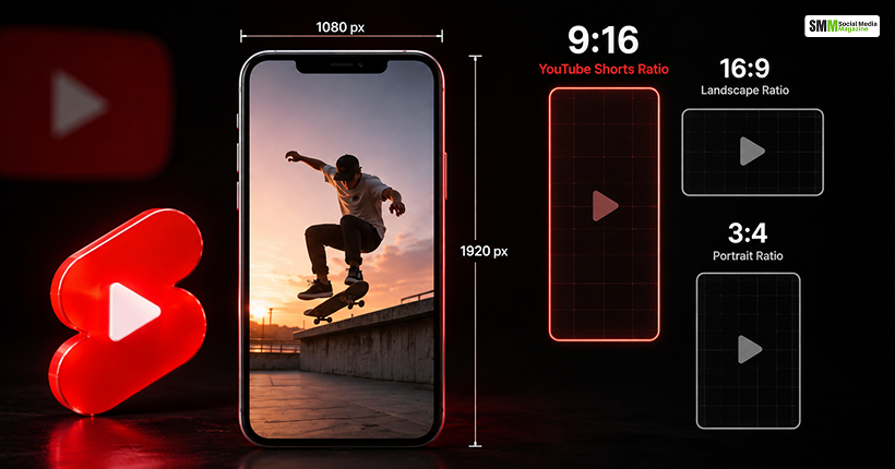
Officially, the YouTube Shorts aspect ratio is 9:16, shown vertically. The ratio is such because of the way we hold the phone.
Also, this aspect ratio is ideal because it allows the Short to take up the entire mobile screen without any awkward gaps on the sides.
The recommended resolution for these shorts is 1080 x 1920 pixels.
Again, if we refer to the YouTube Help documentation of Google, we will find out that a video spanning up to three minutes and having a square or vertical aspect ratio is considered a YouTube Short automatically.
However, if you want to keep a video outside the Shorts feed entirely, you must use a wider ratio, such as 16:9. This ratio is for long-form, traditional videos.
So, to directly address the question asked in the title, the YouTube Shorts ratio is not 16:9. It is not even 3:4 exactly, and this ratio is closer to a legacy Instragram portrait ratio.
YouTube Shorts is built around 9:16, and while 1:1 (square) videos are technically allowed, they aren’t optimized for the format.
9:16, 16:9, and 1:1 are the three most commonly confused ratios on YouTube. This is how they differ.
| Ratio | Orientation | Resolution | Fills Mobile Screen? | Counts As A Short? | Best For |
|---|---|---|---|---|---|
| 9:16 | Vertical | 1080 x 1920 | Yes, fully. | Yes (native format) | Shorts Mobile-First Content |
| 16:9 | Horizontal | 1920 x 1080 | No, letterboxed. | No, treated as long-form | Tutorials ReviewsDesktop/TV Viewing |
| 1:1 | Square | 1080 x 1080 | Partially, black bars at top/bottom | Yes, but not optimized | Repurposed Instagram Content Ad Content |

The 9:16 ratio is not a cosmetic choice. Here are some data points that show why you must be particular about the ratio.
The daily views for YouTube Shorts are now 200 billion on average, as Neal Mohan, the CEO of YouTube, has confirmed in his YouTube Official Blog, “From the CEO: What’s coming to YouTube in 2026.”
Also, in 2026, YouTube will integrate various formats into YouTube Shorts videos. This includes “posting images directly into the feed.”
These new formats will help you engage with your viewers more if you use the optimized ratio.
Around 80% of YouTube’s user base watches Shorts in some capacity, according to Virlo, a social listening and analytics platform.
So, YouTube Shorts are now just a side feature. It is crucial for how people use the platform.
Also, remember that YouTube itself has more than 114 million active channels and over 2.6 billion monthly users across the platform as a whole.
So, being particular about the ratio will only help you to sustain and remain visible in this highly competitive landscape.
3:4 is not an official YouTube Shorts ratio at all.
It is the ratio that you will see in older Instagram portrait posts or certain print and photography contexts.
However, you can repurpose a video shot in 3:4 for Shorts. You just need to crop or reframe it to 9:16 before uploading.
Otherwise, YouTube will letterbox it with bars to fill the vertical frame. This will immediately make the video look unfit for the platform.
If you want to get technical, keep these aspects in mind.
| Spec | Value | Notes |
|---|---|---|
| Minimum Resolution | 600 x 600 Pixels | For Square Uploads |
| Recommended Resolution | 1080 x 1920 Pixels | Standard Vertical Format |
| Maximum Practical Resolution | 1920 x 1080 Pixels | For Higher-Quality Exports |
| Thumbnail Size | 1280 x 720 Pixels | Custom Thumbnails. Shorts Mostly Use Auto-Generated Frames |
| Max Length | Up to 3 Minutes | Square or Vertical Uploads after October 15, 2024 Qualify as Shorts |
If you are following any of these numbers, your video will not look stretched, pixelated, or cropped strangely once it hits different devices.
Here are some practical checks you need to make for exporting your shorts videos correctly.
| Best Practice | What To Do? | Why It Matters? |
|---|---|---|
| Set Timeline First | Set your project/timeline to 1080×1920 before filming or editing. | Prevents losing key visual elements at the edges of the frame later. |
| .Limit Auto-Reframe | Use auto-reframe crop tools in Premiere Pro or CapCut sparingly. | Automatic cropping can easily cut off your subjects or text. |
| Test on Mobile | Preview your video on an actual phone before you publish it. | Desktop previews can be misleading because mobile players adapt differently. |
| Use the Safe Zone | Keep all on-screen text in the middle, away from the edges. | Prevents overlapping UI elements (captions, like buttons, channel names). |
Theory is one thing.
However, here are some real cases where the creators and brands have built and maintained a strong audience base with the correct ratio formatting of their Shorts and videos.
Animator Jake Fellman is a classic example of how vertical-first formatting pays off.
According to YouTube’s own creator blog, Fellman began actively posting Shorts in September 2020 and grew to nearly nine million subscribers within about a year.
Also, at his peak, he used to get tens of thousands of new subscribers every day.
Business Insider and Variety also reported the success story of Jake Fellman with YouTube Shorts.
These reports also highlighted that his channel had barely any traction with regular uploads.
The growth only kicked in once his short, vertical, native 9:16 clips started getting pushed by the algorithm.
He didn’t reformat old horizontal videos, but he built specifically for the vertical frame, and that’s a big part of why the Shorts shelf picked him up so aggressively.
Les Mills, a fitness brand, is an example of how you can use both YouTube Shorts ratios strategically.
Think with Google has published a case study that highlights how the brand repurposed vertical, short-form content it had already made for social media.
Then, it ran a mix of vertical and horizontal creative through YouTube’s Video Action campaigns.
So, every viewer got the video in a ratio that fits their device.
As a result, there was a sharp 52% rise in click-through rate, alongside a 10% drop in cost per acquisition and a 16% drop in cost per impression.
So, the “Always Go Vertical” case does not work here. You have to match the ratio based on where and how people are actually watching.
This smart strategy pays off directly in performance.
On the advertising side, Google has reported that when advertisers add a vertical creative asset into their Video Action campaigns, those campaigns deliver 10-20% more conversions per dollar than campaigns running landscape assets alone.
Also, the agency-reported client data has shown vertical assets driving double-digit lifts in click-through and view-through rates on mobile compared to landscape ads in the same campaign.
Google’s Own Shorts are quite blunt in this matter, and they do not care much about the alternative.
So, the horizontal assets uploaded into Shorts placements have blurred bars filling the empty space, rather than a clean, full-screen frame.
A Digiday + case study analyzed 490 Shorts across 11 beauty influencers.
Some of these creators even had double-digit-million subscriber counts. Also, the group averaged well over 100,000 views per Shorts video.
Each video in that dataset was vertical and had a duration of 60 seconds.
Thus, the videos reflected how thoroughly 9:16 has become the default for creators who depend on consistent short-form reach rather than one-off viral hits.
| Case | Ratio Strategy | Reported Result | Source |
|---|---|---|---|
| Jake Fellman | Native 9:16 Only | Grew to 9M Subscribers in About a Year. | YouTube Creator Blog |
| Les Mills | Mixed 9:16 and 16:9, Matched to Device | 52% More CTR 10% Less Cost per Acquisition16% Less Cost per Impression | Think with Google |
| Google Ads Advertisers | Vertical Asset Added to Campaigns | 10-20% More Conversions per Dollar | Google Ads Internal Data |
| 11 Beauty Influencers | Native 9:16 Ratio with Duration Under 60 Seconds | Avg. 100,000 views Per Short Across 490 Videos | Digiday Research |
The examples or case studies show that the success stories are not isolated flukes.
A solo animator, a global fitness brand, aggregated ad platform data, and a multi-influencer study all point in the same direction.
Content built natively for 9:16, or deliberately paired with the right ratio for the placement, consistently outperforms content that treats aspect ratio as an afterthought.
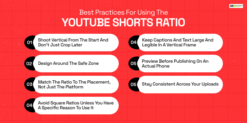
Just picking 9:16 as the ratio is not the end of the story if you want your YouTube Shorts to perform well.
Follow these best practices that actually work.
If you are filming the content natively in the 9:16 format, it will help keep the composition, focus, and framing intact.
However, if you are shooting a horizontal video and cropping it for the upload, it can lead to cutting off subjects, text, or important background detail that was fine in the original frame.
YouTube’s UI overlays elements like the like button, channel name, and description on top of your video, mostly along the right edge and bottom of the screen.
Keep faces, text, and key visuals centered and away from those edges so nothing important gets covered.
As we have seen in the Les Mills case study, you can run a mix of vertical and horizontal creative.
This mix needs to match where each viewer is watching. Also, it can outperform defaulting to a single ratio everywhere.
1:1 is technically accepted as the YouTube Shorts ratio. However, it leaves the top and bottom of the screen empty.
You can use this format to repurpose square content for YouTube.
However, shooting new content in this format will not be a smart idea.
Shorts are often consumed with the sound off.
So, these Shorts must have on-screen texts, which are properly readable.
A properly filled 9:16 frame gives text more room to breathe than a cropped or letterboxed video does.
You cannot trust the preview of the editing software completely.
The preview may not reflect exactly how safe zones, captions, and cropping will look once YouTube’s mobile player and interface elements are layered on top.
What does your audience expect?
Do they expect full-screen, vertical content?
Then, mixing in horizontal or square Shorts can create a jarring, less professional viewing experience even if each video is technically compliant.
Neither 16:9 nor 3:4 is the answer to what the ideal YouTube Shorts ratio is.
The YouTube platform is purpose-built around 9:16. Also, every technical decision, from resolution to how the algorithm distributes Shorts, is designed around that vertical frame.
On the other hand, 16:9 is a format for long-form content, not Shorts.
Again, 3:4 is a ratio you will want to convert away from rather than shoot natively in.
Nail the ratio, and the rest of your Shorts strategy has a much better shot at actually being seen.

Sibashree has been into SEO and eCommerce content writing for more than 9 years. She loves reading books and is a huge fan of those over-the-top period dramas. Her favorite niches are fashion, lifestyle, beauty, traveling, relationships, women's interests, and movies. The strength of her writing lies in thorough research backing and an understanding of readers’ pain points.